Have you ever wondered why so many different fast food restaurants all use the same colour scheme? Why the big social media platforms use blue as their theme? After noticing the similar colour schemes that are used for different organisations’ COVID-19 campaigns, you may be wondering why the same types of advertising all use the same colours.
It’s because of colour psychology: a tool used in marketing to understand what draws consumers to a product.
Colour psychology is the study of colours, and how it corresponds to human behaviour. E-commerce expert Nicole Martins Ferreira once wrote, that colour psychology can be used to understand why consumers may buy one product, but not another.
“Do the colours of a package make us choose one brand over another?” asks Martins Ferreira in her article, ‘Colour Psychology: How Colour Meanings Affect Your Brand.’
Simply put, it does. Colours, according to Ferreira, have an impact on why we buy things, but colour psychology can also tell us why certain colours have more of an impact than others.
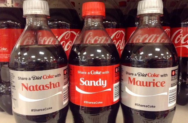
Red for example can stimulate hunger, which is why you’ll see brands like Kellogg’s, Coca Cola, and, KFC using it in their packaging and logos. The colour blue is used on social media sites such as Facebook and Twitter because it has the ability to calm people down, and is also seen as non-threatening.
Marketing associate professor at RMIT University Dr Foula Kopanidis says that the use of colour in marketing as a form of communication has been around since the beginning of advertising in coloured television.
“As a subconscious cue, marketers have continued to utilise colours in their IMC – integrated marketing communication campaigns – to stimulate interest and enhance desire for purchasing a specific product or service,” she told upstart.
Scott Schwertly is the CEO of Ethos3, a keynote presentation design company, and wrote that colour psychology dates back all the way to ancient Egypt. He said that while there is evidence to suggest consumers react to products with colour in mind, many studies that are done on colour psychology are anecdotal at best.
“Preferences for certain shades and responses that rely on ‘feeling’ are difficult to measure,” he wrote.
Dr Kyle Murray, the Vice-Dean of the School of Business at the University of Alberta says that whenever you do anything visually, colour has to be considered.
“Even if the effect is going to be relatively small, a really angry person at a customer service desk is not going to relax just because you paint the customer service desk blue, but it might help a little bit in improving their mood,” he told upstart.
Despite colour being subjective, it’s still an effective tool in marketing and even in government campaigns such as the Australian Government’s website and posters about COVID-19. Also consider the colours used in the Victorian State Government’s videos and posters about COVID-19 and you’ll notice something pretty quickly: They all use the same type of colours, and Dr Kopanidis says this is deliberate.
“Colours significantly influence human beings’ lives in a variety of contexts to evoke a desired response. Bright colours are linked with positive emotions like happiness, joy and hope,” she said.
The table of colours and their meanings shows why we see the same couple of colours in coronavirus media campaigns. For example, green, which has appeared frequently in posters and advertising throughout the pandemic represents health and hope.
The use of blue in other posters by the federal government may be used to represent authority and trustworthiness as the table suggests.
While studies have found that colour psychology is anecdotal due to its subjectiveness, there is still plenty of evidence that says otherwise. A study by Kurt Sevinc and Kingsley Osueke Kelechi published in 2014 titled ‘The Effects of Colour on the Moods of College Students’ found that colour impacted how students felt when they entered a particular restaurant.
“Majority of respondents felt psychologically warm and invited in Palm Inn. Colours used in the space are shades of green, grey on the walls, and the dining furniture is black and brown tables covered in white and black clothing. Shades of green have a relaxing and refreshment effect,” they wrote.
Article: Imogen Howell is a second year Media and Communication student (Journalism) at La Trobe University. You can follow her on Twitter @Imogen_Howell
Photo: “Share a Coke” by Mike Mozart available HERE. Available under a Creative Commons Attribution (CC BY 2.0)


.jpg)